


You Can't Judge a Book by its Cover.
... but you can judge if it's a good cover

If you know me, you know I'm particular about every aspect of our books. Jim will attest to this, This might come from my background as a professional creative director in the advertising and marketing world, or maybe it's just a part of why I got into writing—to have more creative control over the details. But, as high-minded as that reads, it also means I have to (choose to?) do the work. Which can often suck. While the writing process with Jim and I deserves its own post, today is all about the cover design.
The Crucial Role of a Book Cover
Book covers can totally make or break a book. Picture this: you're in a crowded bookstore or scrolling through Amazon. What's the first thing that grabs your attention? Yep, it's the cover. It needs to pop, to scream, "Pick me up!" A killer cover catches your eye and gives you a taste of the story inside.
It sets the vibe and makes you want to dive in. On the flip side, even the most amazing book can get totally ignored if the cover doesn't cut it. It's all about that first impression, folks. In the book world, the cover is your best shot at getting noticed. So, yeah, it's huge.

The Mackinac Island Novels: A Thematic Journey
The Mackinac Island novels all share a cohesive theme—layers of blue with yellow accents and a specific font called Didot. When we started this self-publishing journey, we were pretty clueless about the whole process. Looking back, I might have gone a little wilder on the first book, "The Dockporter," if I had been thinking more strategically. But now, the look has become a signature style for the series, and we’re sticking with it. The consistent theme gives the books a sense of unity and makes them instantly recognizable to our readers. It’s a fun look, and it works for us, tying together the vibrant, quirky spirit of Mackinac Island with each new story.

The Process: A Collaborative Effort
In the past, I've worked with Stephanie Tam, a very talented artist and colleague of mine. I would give her some basic designs, and then we’d refine them together. She’d create assets and help with the layout. She was invaluable for both “The Dockporter” and “Somewhere in Crime.” However, Stephanie wasn't available this time, so I've been working on the cover while revising the book simultaneously. It’s been tiring, but also fantastic, as the revisions have helped clarify the cover’s direction. They work in tandem. A constant evolution.
Leveraging Community Feedback
One of the perks of our strong, loud, hilarious Facebook group is the ability to bounce ideas off an engaged audience. Jim and I have our opinions and constantly banter, but being able to submit different ideas for feedback to a group of two thousand people is incredible. Not many authors put their covers up for a vote, but we love using our community to squeeze out all the creative juice we can. It's a new era where the solitary artist is evolving into something more collaborative, and that's one of the best parts of this process.

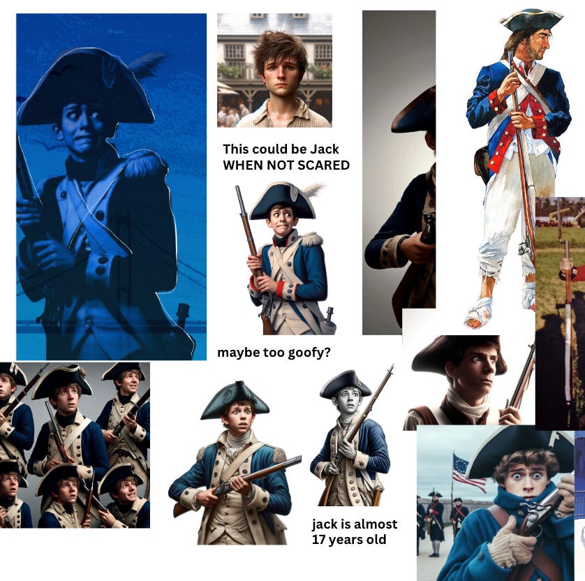
Initial Concepts and Changes
We started with the idea of Jack, a guide at Fort Mackinac, looking nervous and out of place. Initially, we weren’t even sure what the title of the book would be. We toyed with "Hysterical Fiction" and "Fort Maniac" as titles before landing on "MisGuided," (thanks to another vote). With the title set, we moved away from just focusing on a nervous Jack to a broader concept
.
The Evolution of the Cover
Originally, Jim and I thought about placing Jack at Fort Mackinac with the iconic blockhouse in the background.

But then, we decided to play with the idea of showing the island in the distance, Jack as sentinal, which opened up a whole new level of confusion. Designing an abstract version of Mackinac Island is tricky because everyone has their own idea of what it should look like. We had to balance including recognizable elements without making it too cluttered. Eventually, we decided to keep it abstract, just a hint of the island.

The Font Debate
The next big discussion was all about fonts. We’re planning to refresh all three books eventually, but for now, we had a lively debate on whether this book needed the same font treatment as the previous two. Initially, the title "MisGuided" didn’t look good in print unless it was in a script font.

My daughter Kelly was adamant that we shouldn't break form from the previous books too much. After one last attempt in a coffee shop while she was studying for her SATs, I came up with the idea of overlapping "Mis" and "Guided." It looked cool, so we put it up for a vote, and the tribe approved.

Final Touches
The final steps involved adding minor details to make the island less “vector-like” and slightly more realistic. This included tiny pine trees for texture and a freehand drawing of the fort to give it an abstract feel. The back cover was easier; we decided to keep it simple with a historical vibe, fitting the book's theme.

It’s Almost Done!
Overall, the cover has come together nicely with the help of our friends, fans, and family. It still needs some tweaks, but we’re feeling fantastic about the evolution.
If you’re wondering if this newsletter is a form of procrastination to keep from revising the book, the answer is yes. Yes, it is.

I like the cover. I think linking the M and G is very creative and unique. I wish you well.
The covers are beautiful. I love that they match. It makes the display very eye catching